CivicTheme Overview for the Cardano Community

Are you a Cardano app developer focusing on developing decentralised applications (dApps) on the Cardano blockchain? Here are some resources about the CivicTheme design system that you may find useful. A well-thought-out design system can significantly streamline the development process, ensure consistency across your application, and enhance user experience.

Welcome Cardano world! Hello Cardano UX!

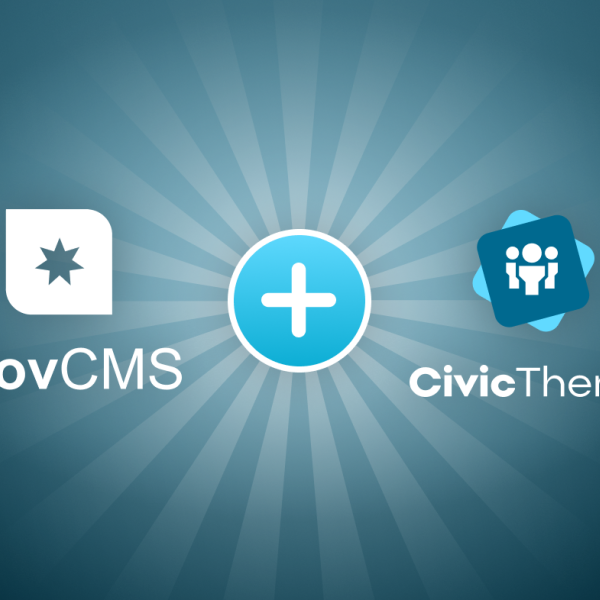
We've thrown our hat in the ring for the Cardano Partners and Real World Integrations grant! We're very excited, and want to tell you about the power a design system could bring to the Cardano ecosystem. We've gathered this info to give you a background on CivicTheme, and how it could be extended to provide transactional patterns to work with your Cardano apps.

  • Semantic HTML
  • Data Driven
  • WCAG AA

What is CivicTheme?

Create engaging, inclusive and consistent digital experiences quickly!

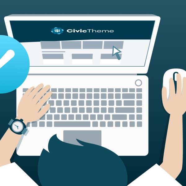
CivicTheme is an open source, inclusive and component-based design system. It was created so governments and corporations can rapidly assemble modern, consistent and compliant digital experiences.

CivicTheme health home page example with banner in teals and white

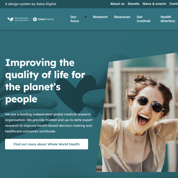
The CivicTheme Design System is...

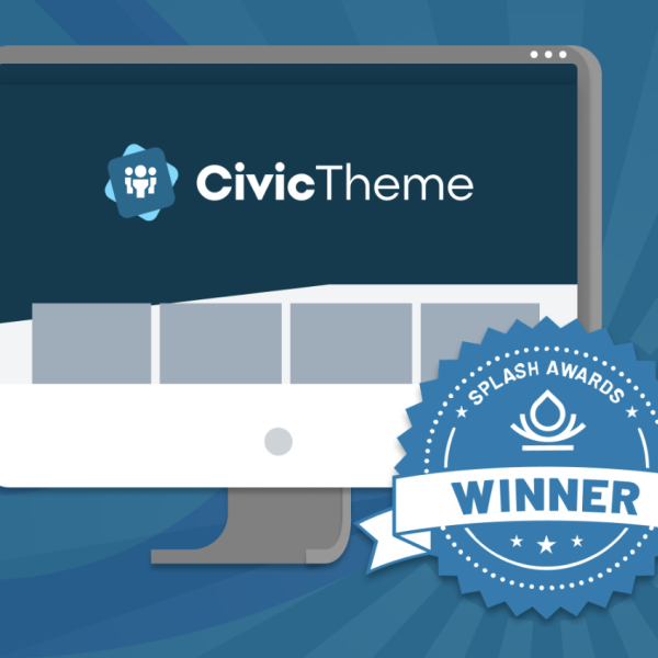
An award winning design system with easy styling and customisation and flexible UI components.

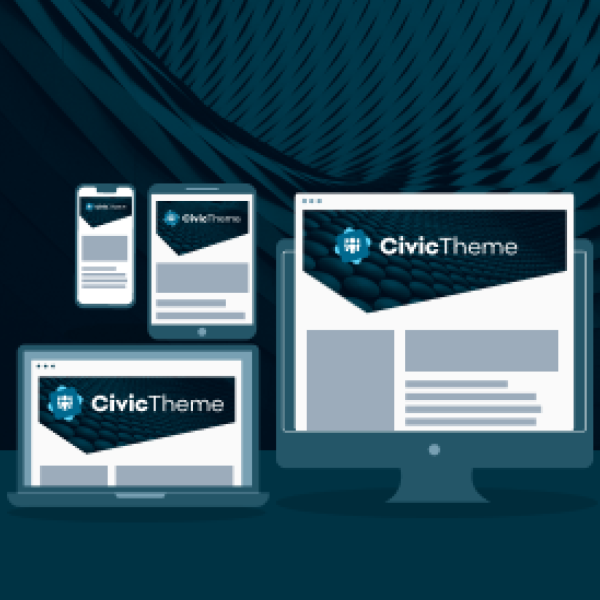
Award-winning design system

The CivicTheme Design System designs start in Figma as the basis of a responsive, award-winning user experience.

A board with 6 tiles of icons

Figma Design File (Opens in a new tab/window)

The CivicTheme Design System is implemented as a Figma file that provides a visual representation of components and their usage within design templates.
CivicTheme screenshot on multiple devices

Responsive Design (Opens in a new tab/window)

CivicTheme is fully responsive and provides a customisable grid utilising a flex-based system adapted from the SASS flexbox grid.
CivicTheme Splash Award Winner Graphic with monitor and badge

Award Winning UX (Opens in a new tab/window)

CivicTheme won the Design/UX Award at the annual DrupalSouth Splash Awards held in Wellington, New Zealand, in 2023.

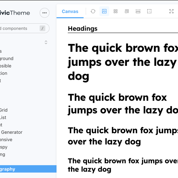
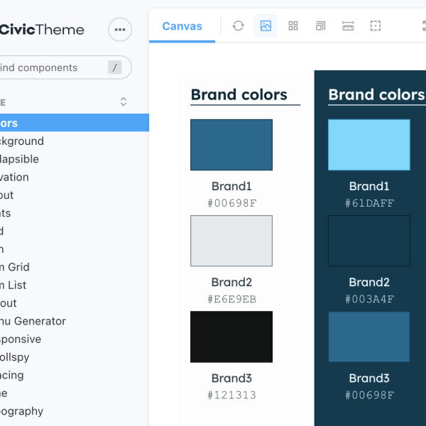
Easy styling and customisation

CivicTheme lets you style your application to support branding requirements with light and dark mode options, color palette variations, and font adjustments.


CivicTheme Storybook showing how to choose colors

Configure Colors

CivicTheme allows you to change the color of all elements from the configuration page without additional development.

CivicTheme Storybook with switching from light to dark mode

Light and Dark Mode

CivicTheme lets you configure your components in light or dark mode for the best experience for your users.

CivicTheme Storybook typography settings

CSS Variables

CivicTheme UI kit contains a large number of variables to adjust colors, typography and spacing.

Slide 1

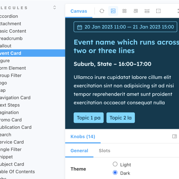
Flexible UI components

Over 60 atomic-design components can be used directly out-of-the-box or easily customised for your web applications.

Content Components (Opens in a new tab/window)

CivicTheme comes with many out-of-the-box components to build your web application.

UI Kit Storybook (Opens in a new tab/window)

Storybook shows all components available in the library and lets you try different settings.

UI Kit GitHub Repo (Opens in a new tab/window)

GitHub repository for the UI Kit component library with Storybook integration.

The CivicTheme Design System has...

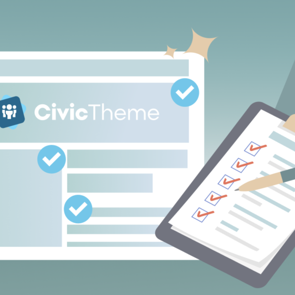
Solid compliance with digital standards and best practices, real-world implementations, documentation and guides, a strong governance model, and endorsement by leading authorities.

Compliance and implementations

We believe in open source, digital standards, and working with tried and true technologies. Check out our roadmap for additional standards and implementations on our radar such as React and world-recognized security frameworks.
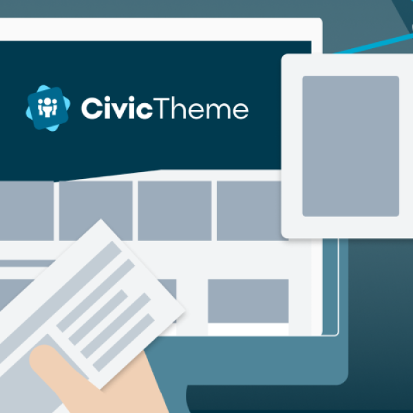
Theme thumbnail

Accessibility Compliance

CivicTheme is a government-grade design system that has been reviewed for WCAG 2.2 AA compliance.
A board with 6 tiles of icons

Government Standards

CivicTheme was inspired by the former Australian Government Design System and has been uplifted with new features and functionality.
CivicTheme Splash Award Winner Graphic with monitor and badge

Drupal Implementation (Opens in a new tab/window)

Our first CivicTheme implementation was built to support the popular Drupal Content Management System.
GovCMS and CivicTheme logos in blues and teals and white

GovCMS Implementation (Opens in a new tab/window)

The CivicTheme Design System has been included in the Australian whole-of-government CMS program, GovCMS.

Governance and endorsement

Good open source software is not enough; it needs proper governance and endorsement to be sustainable and successful. CivicTheme has both!

More on the CivicTheme Design System...

Check out our articles and videos, join our community, and tell us what you need from a design system.

Submit an Idea (Opens in a new tab/window)

Have a great idea for making CivicTheme even better? Submit it! Or check out what the community has already suggested.

Join Slack (Opens in a new tab/window)

Join our Slack channel to collaborate. While this is a Drupal channel, more channels will be added as we build more implementations.

Start contributing (Opens in a new tab/window)

Ready to dive in and help out? We'd love you to join our contributors to help with design, code and documentation contributions!

Immerse yourself...

We'd love to hear from you!

Have a question? Have feedback? Let us know!

Sign up

Sign up for news and updates from our agency.